
. . . to be lean, to maximize flexibility and minimize code bloat.
– www.codex.wordpress.org/Plugins
How fine to feel so fit from header to footer! That code bloat was killing me, I swear.
Now, I can maximize or minimize, mix and match, and if bugs can be fixed, I can flex unguessed-at muscles. The codex is the limit. This code seems most commodious.
I could rename every post slug “melvin” for the sheer hell of it. I could allow pings and trackbacks like a nervous hiker in grizzly country. I could learn to preprocess my hypertext, or content myself with editing the timestamp.
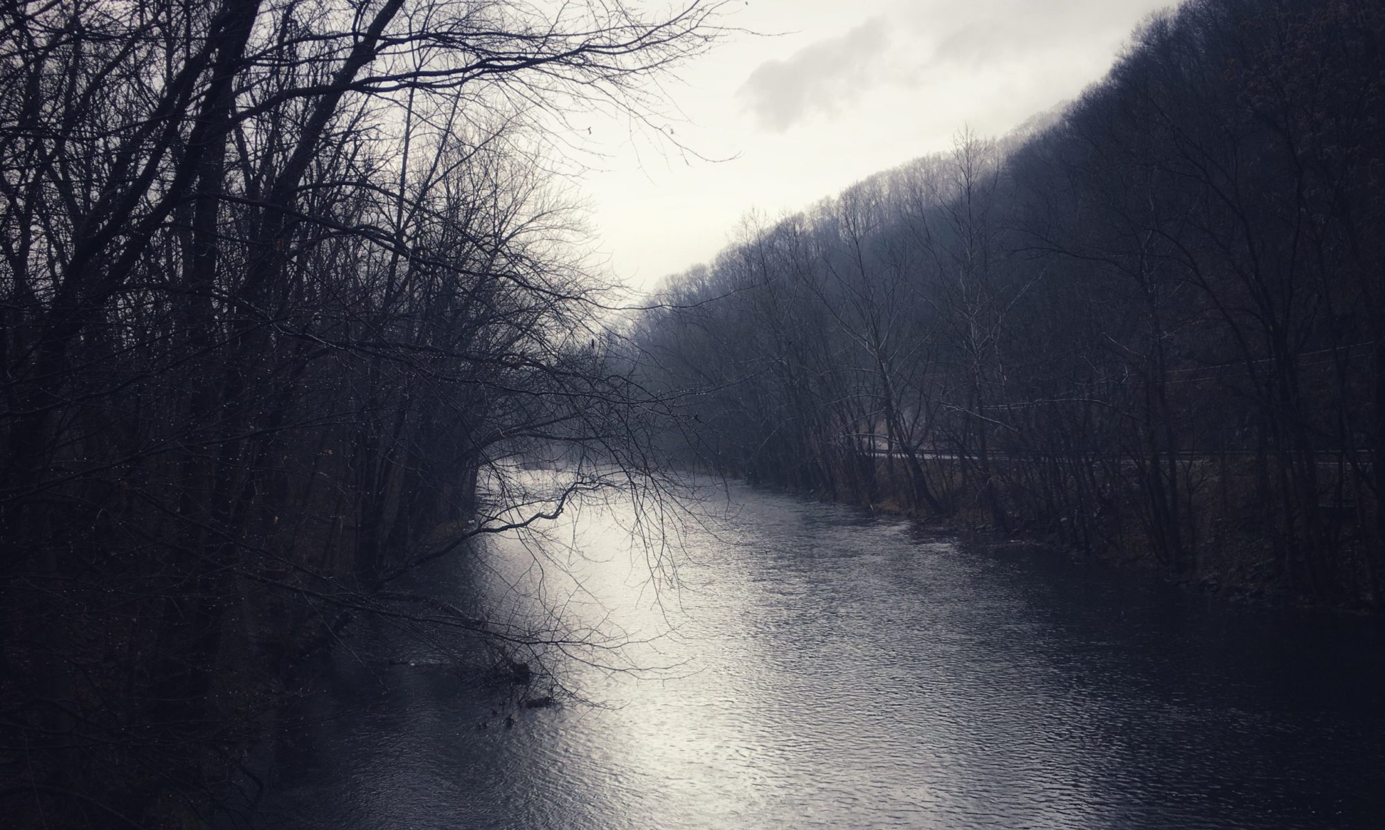
I grow old . . . I grow old . . . I shall wear the bottoms of my sidebar blogrolled. Gray as a gravestone this theme in which I chip. I must prepare to meet the dead links with a 404 message that reads, Found – just not found here, and not by anyone you’ve ever heard of.
*
O.K., don’t mind me – just getting a little punchy here! Make yourselves at home. If you need anything, I’ll be down in the archives putting in shelves and cabinets, and unpacking things I didn’t know I had.
Happy Spring Cleaning! Your new template is quite handsome….and I too like shades of grey….but….(I hesitate to raise an objection,) your new text is hard to read. For readability, your Blogspot template was hard to beat–black sanserif text on a pale grey background. (Smokey grey, the template called it; myself, I chose a lovely background grey called, lyrically, #f6f5f9).
When I was your age (not THAT long ago), I never imagined there would be a big difference between reading dark colored text and black, or that serifs could make much difference in readability.
Of course, I can continue to read Via Negativa in Bloglines, where I use the text size “medium” and where black sanserif is the standard. But remember: If we’re lucky, and we live long enough, we’ll all of us be vision-impaired someday.
‘Tis the season for packing and sorting, cleaning and moving. And, apparently, for having network difficulties. Here too.
O.K., I guess one phantom comment (from me) isn’t too steep a price to pay here. We had some tech problems that were interfering with commenting, but fortunately my blog host/volunteer tech support guy – my ubergeek cousin Matt – was able to get it fixed. Also, we increased the text size to try and improve readability. Please let me know if you still have trouble reading.
Yes, that’s a better font… it’s just that I sit quite far from the computer nowadays… but I read your posts on bloglines, and there it’s a regular-sized font. An exciting move you’ve made, over here, too. Opens more possiblities.
Brenda – Thanks for the feedback. It’s the same font, just bigger. If I get bored with Georgia, I’d probably switch to Garamond. Must have serifs! (I just got around to checking how it looks in IE, too: O.K., but not as good as Firefox. I don’t know about Safari, etc.)
If you’re interested in considering a move at some point, keep an eye on WordPress.com, which is ramping up to compete with Blogger for the free blogging market. At present, their choice of templates is extremely limited, but you don’t have to worry about finding your own blog host and tech support as I have done. According to a recent interview with their founder in Business Week magazine, wordpress.com blogs will stay free except for special options for high-traffic blogs, just like Blogger.
Currently I’m Palatino – liking not only the font itself, but the name, which, for some reason, reminds me of Italian heights, Giordano Bruno and the House of Memory in the Renaissance (re Francis Yates’ book), and that the blog form is a kind of ‘house of memory’ of its own.
I sometimes do multiple posts for different reasons. Doing this most recently with Flikr, I discovered a neat thing. When you do a “file info” in Photoshop on a photograph and enter your copyright information, if you copy & paste your blog entry into “description” it travels with the photograph and can be unmasqued at any time on its transit through the NET. When you post a photo at Flikr, that blog entry is automatically posted with the photograph and is available to anyone who clicks on it to see a larger size. It’s neat.
Thanks for the ‘insider info’ :-) on WordPress, everyone who uses it seems very happy with it and I’ve had my eye on it for some time…
The way you are categorizing your writing is quite wonderful.
A kind of Giordano Bruno thing to do… :-)